Table of Contents
ToggleChoosing a bedroom color is one of the most impactful decisions a homeowner can make, it sets the mood for your personal sanctuary and influences how well you sleep. Unlike living rooms or kitchens, where bold statement colors can shine, bedrooms demand a more thoughtful approach. The right color palette promotes relaxation, reduces visual clutter, and creates an environment your brain recognizes as a place to unwind. Whether you’re drawn to cool tones that mimic a serene sky or warm neutrals that feel like a cozy embrace, the color you choose should align with both your personal taste and your sleep goals. This guide explores 11 proven bedroom color ideas ranging from classic calming shades to modern sophisticated tones, helping you find the perfect hue for your retreat.
Key Takeaways
- Cool tones like soft blues and sage greens are scientifically proven to lower heart rate and blood pressure, making them ideal bedroom color ideas for better sleep.
- Warm neutrals such as cream, beige, and warm whites create a cozy, sophisticated environment that works across any design style and won’t require repainting when trends shift.
- Dark tones and charcoal grays can create a modern, intimate retreat but require proper lighting design and careful execution to avoid making the room feel claustrophobic.
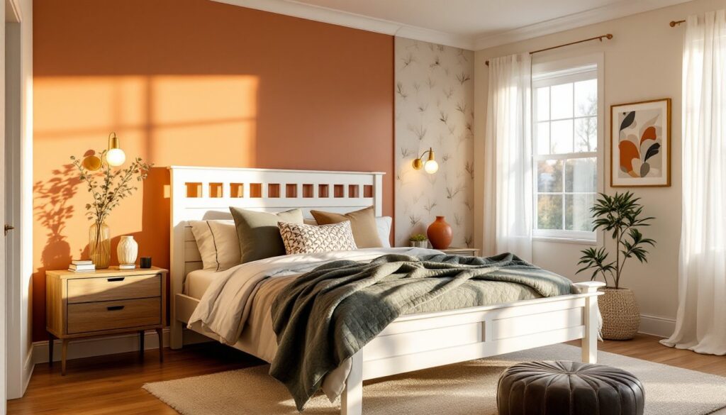
- An accent wall behind the bed using jewel tones or a deeper shade adds visual interest without overwhelming the entire space.
- Always test paint samples in your bedroom at different times of day, as lighting significantly impacts how colors appear on your walls.
- Invest in quality primer and proper surface preparation when painting, especially with warm neutrals and dark colors, to achieve even coverage and a polished final result.
Cool Tones for a Calming Retreat
Cool colors, blues, greens, and their variations, naturally lower heart rate and blood pressure, making them ideal for sleep spaces. These hues mimic nature’s most restful elements: water, sky, and vegetation. Homeowners often find cool tones easier to live with long-term because they don’t feel as emotionally intense as warm colors. The key is choosing the right shade and saturation: go too bright and you’ll have an energizing space, but dial it back with softer, muted versions and you’ve got a bedroom sanctuary.
Soft Blues and Aquatics
Soft blues remain the most scientifically proven color for promoting sleep. Think of shades like dusty blue, periwinkle, or pale sky blue rather than bright navy or cobalt. These colors work beautifully on all four walls and pair naturally with white trim and soft white bedding. If you’re hesitant about committing a full room to blue, consider painting a single accent wall in a deeper aquatic shade, perhaps a dusty teal or muted slate blue, while keeping the remaining walls soft white or cream. This gives you the calming effect without overwhelming the space.
Aquatic shades like seafoam and soft turquoise sit at the intersection of blue and green and offer a slightly fresher feel than pure blues. These work especially well in bedrooms with east or west-facing windows where natural light fluctuates throughout the day. The undertones in aquatic shades shift subtly with changing light, keeping the space visually interesting without demanding attention.
Serene Greens and Sage Shades
Green is nature’s color, and soft, muted greens, particularly sage, pistachio, and celadon, deliver profound calming effects. Sage green, which blends gray undertones with soft green, has emerged as a favorite among interior designers for 2025 and beyond. It reads as sophisticated and current while maintaining the stress-reducing qualities of green. Unlike brighter lime or kelly greens, soft sage works beautifully as a full-room color without creating visual fatigue.
When selecting green, pay attention to undertones. Greens with yellow undertones feel warmer and more energizing: greens with blue or gray undertones feel cooler and more restful. For bedrooms, gravitate toward the cooler side of the green spectrum. Pair sage or pistachio walls with natural wood furniture and linen fabrics to amplify the organic, grounding feeling. Many homeowners find green easier to style than blue because it complements a wider range of accent colors, warm metallics, soft whites, natural wood, without clashing.
Warm Neutrals That Promote Relaxation
Warm neutrals offer the best of both worlds: they’re soothing without being cold, sophisticated without demanding careful styling. These colors, creams, warm beiges, soft taupes, and warm whites, work across virtually any design style and age well, meaning you won’t feel the urge to repaint in two years when trends shift slightly.
Creams, Beiges, and Warm Whites
Cream and warm beige create an enveloping, intimate atmosphere that many find more comfortable than stark white. These shades sit on the border between warmth and neutrality: they have just enough pigment to feel intentional and cozy without introducing true color. When shopping, grab paint samples and test them in your bedroom at different times of day, cream can shift dramatically depending on your lighting.
Warm whites (sometimes labeled “off-white” or “ivory”) avoid the sterile feeling of pure white while maintaining the brightness and openness that white provides. Shades like Swiss coffee, accessible beige, or agreeable gray deliver a clean canvas that makes it easy to change bedding, artwork, and furnishings without worrying about color clashes. The advantage here is flexibility: warm whites won’t dictate your decor direction, so you can pivot your style without repainting.
When applying warm neutrals, remember that primer and paint coverage matter. A single coat often won’t provide adequate coverage, especially if you’re painting over a darker color. Use a quality primer (like BIN or Kilz) before your finish coat to ensure even color and reduce the number of finish coats needed. Warm neutrals tend to show brush marks and roller imperfections more readily than darker colors, so invest time in proper surface prep and use quality brushes and rollers.
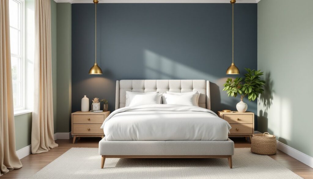
Sophisticated Dark Tones for Modern Bedrooms
Dark bedroom colors, deep grays, charcoal, navy, and even muted black, have gained traction in modern design, especially in homes where homeowners want a moody, intimate retreat. The psychology here works differently than with light colors: dark tones absorb light, making a room feel more enclosed and womb-like, which many find deeply relaxing. But, dark colors require more careful execution and lighting design.
Deep gray, particularly those with cool blue undertones, creates a sophisticated backdrop that feels contemporary and calming. Charcoal gray and slate tones sit between pure black and lighter grays, offering drama without the lightness-absorbing intensity of black. These dark tones pair beautifully with interior design trends and color inspiration from modern sources, creating visually striking spaces that don’t feel sterile.
Before committing to a full dark bedroom, consider the room’s natural light. South-facing bedrooms with abundant sunlight can handle dark tones: north-facing or interior bedrooms may feel claustrophobic. Also plan for artificial lighting: dark walls require intentional task lighting, accent lighting, and a brighter overall lumen output than lighter rooms to avoid creating a cave-like atmosphere. A dark-painted bedroom without proper lighting becomes gloomy rather than cozy.
Dark colors also show dust, pet hair, and imperfections more readily than light colors. Use a satin or semi-gloss finish rather than flat to make cleaning easier and to help the color reflect a bit of light. Apply two full coats of quality paint with proper primer underneath to achieve depth and even coverage. The visual payoff, a sophisticated, intimate retreat, is worth the extra preparation.
Accent Wall Ideas to Add Visual Interest
An accent wall lets you experiment with bolder colors, patterns, or finishes without overwhelming the entire space. In a bedroom, an accent wall typically goes behind the bed, the visual focal point, though it can work on any wall depending on furniture layout.
If the rest of your bedroom is pale blue or cream, consider a deep jewel tone like emerald green, sapphire blue, or even a muted burgundy for the accent wall. These darker, richer colors ground the space visually and create a sense of luxury without making the room feel small. Alternatively, if you want subtle sophistication, choose an accent wall that’s just one or two shades deeper than your surrounding walls, a cream room with a warm taupe accent wall, or soft blue with a slate blue accent.
Pattern-based accent walls (via wallpaper or a mural) work in bedrooms but require careful color selection to avoid overstimulation. Geometric patterns in muted tones or botanical prints in soft greens and neutrals can add visual interest without disrupting sleep quality. Many homeowners pair patterned accent walls with solid-colored side walls in a complementary neutral to balance visual weight.
When painting an accent wall, use the same paint type and finish as the surrounding walls to avoid obvious sheen differences. Mask off edges cleanly with painter’s tape, apply primer if switching colors dramatically, and use quality brushes at corners and edges. Taking time at the prep stage prevents noticeable lap marks or color bleeding that would undermine the intentional accent wall effect. The accent wall trend has evolved: modern design favors subtle, sophisticated accents over high-contrast statements, so resist the urge to go too bold unless you’re aiming for a truly daring modern bedroom design inspired by contemporary home design examples.