Table of Contents
ToggleYour bedroom doesn’t have to be beige. Whether you’ve lived with soft neutrals for years or you’re ready to shake things up, adding color to your bedroom creates warmth, personality, and a space that actually feels like yours. The good news: colorful bedroom ideas don’t require a complete overhaul or a professional designer’s budget. From rich warm tones to cool, calming hues, you can transform your sanctuary with paint, textiles, and strategic accents. This guide walks you through seven practical color approaches that work for any style, skill level, and lifestyle, because the best bedroom is one you’ll love waking up in.
Key Takeaways
- Colorful bedroom ideas using warm tones like terracotta and gold create intimacy and coziness without requiring a professional designer or complete overhaul.
- Cool colors such as soft blues, greens, and purples promote relaxation and better sleep, making them ideal choices for a calming bedroom sanctuary.
- An accent wall is the fastest way to add bold, saturated color to your bedroom while maintaining balance and reducing visual overwhelm.
- Follow the 60-30-10 design rule—60% neutral base, 30% secondary color, and 10% accent color—to keep your colorful bedroom cohesive and intentional.
- Multicolor bedding offers flexible color expression that can be swapped seasonally, allowing you to update your bedroom mood without paint or permanent changes.
- Proper lighting in warm-white (2700K) or cool-white (4000K) bulbs is essential to complement your chosen colors and prevent dark, unwelcoming spaces.
Warm Color Palettes for Cozy Bedrooms
Warm colors make a bedroom feel intimate and grounded. They’re especially effective in rooms that receive natural light from the north or west, where cooler afternoons can feel chilly. If you’re looking to add depth without going dark, warm palettes are your easiest entry point.
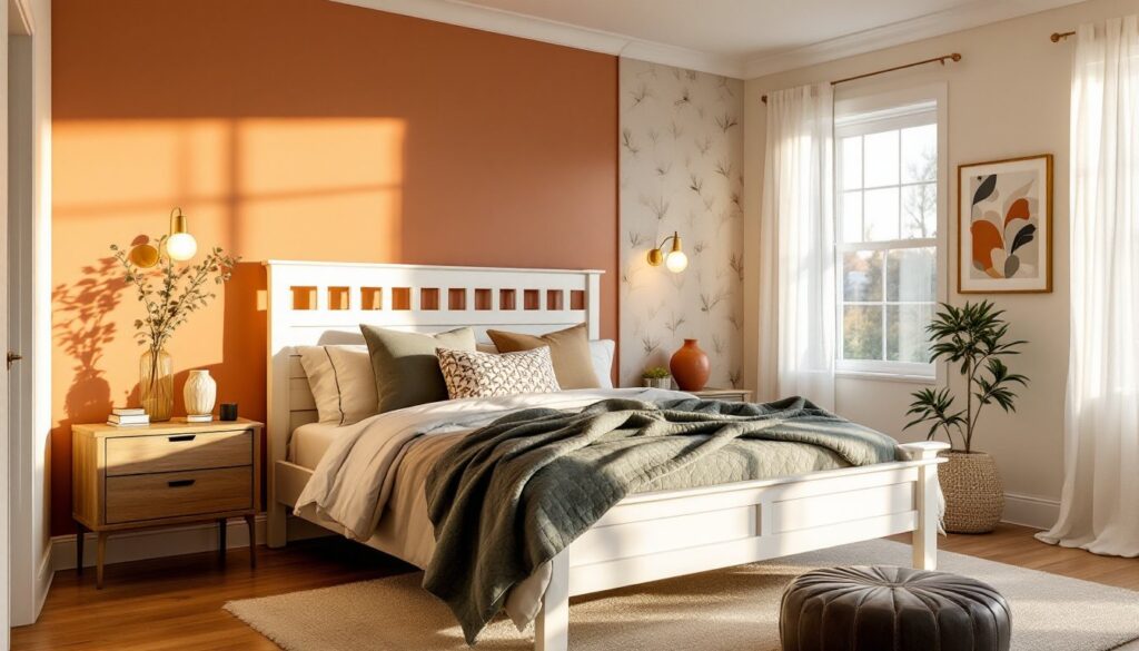
Rich Oranges, Terracotta, and Gold Accents
Oranges and terracottas work beautifully on accent walls, just one wall painted in a warm, muted terracotta can anchor the entire room without overwhelming it. Look for colors labeled “burnt orange,” “rust,” or “dusty terracotta” rather than bright traffic-cone orange: these read as sophisticated rather than juvenile. Pair them with warm whites, cream, or soft tan trim and bedding to prevent the room from feeling cave-like.
Gold accents amplify the warmth without requiring you to paint everything. Light-fixture finishes, picture frames, or even incorporating bright colors in bedroom styling through metallic hardware and drawer pulls create visual interest. A terracotta wall pairs naturally with brass or warm-gold metals: avoid mixing with cool silvers, which will fight the warmth you’re building.
When painting a warm-colored accent wall, prep the surface thoroughly: fill any gaps or holes with spackling compound, sand lightly (120-grit), and prime with a stain-blocking primer. Terracotta can require two coats of paint for even coverage. Use painter’s tape on the trim to keep clean lines, and consider renting a paint sprayer if the wall is large, it gives a smoother, more professional finish than a roller for bold colors.
Cool Color Schemes for Serene Spaces
Cool colors, blues, greens, and purples, create a calming environment that encourages rest. They work especially well in bedrooms with strong southern or eastern light, where they won’t make the space feel dim. Cool palettes are ideal if you struggle with sleep or stress: research consistently shows that these hues support relaxation and lower heart rates.
Soft Blues, Greens, and Purples
Soft, muted blues (think slate blue, dusty sky blue, or pale periwinkle) are the safest cool choice, they’re proven to work in nearly any bedroom without looking trendy or dated. A full-room paint in soft blue with white trim is a classic approach. If you want more drama, try a deeper blue-gray on the wall behind your headboard, keeping the other three walls white or soft cream.
Greens, from sage to soft eucalyptus, bring the outdoors in and work for any design style. Greens pair beautifully with natural wood, linen textiles, and brass hardware. Unlike some trendy pastels, a true soft green remains timeless and versatile.
Purples require more caution: lean toward muted lavender, dusty mauve, or soft lilac rather than saturated plums, which can feel heavy in a bedroom. Test paint samples on your wall and observe them throughout the day, artificial light and natural light reveal different undertones. Many design resources like MyDomaine’s interior styling guides offer color mood boards and swatches to help you visualize combinations before committing.
When selecting cool colors, verify the paint’s undertones: some “blues” contain yellow undertones and read as greenish-gray, while others lean slightly purple. A paint store will often provide large sample chips, tape them to your wall, leave them for 24 hours, and check them in morning, afternoon, and evening light before painting.
Bold Accent Walls and Feature Design
An accent wall is the fastest way to add color without committing your entire room to it. Paint one wall a bold, saturated color while keeping adjacent walls white or neutral. This technique draws the eye, creates depth, and lets you experiment without risk. Many people choose the wall directly behind the bed or headboard, as it becomes the visual focal point.
Bold accent colors for 2026 include deep jewel tones (emerald, sapphire, rich plum), warm burgundy, and even tasteful charcoal or near-black (which reads as dramatic rather than gloomy if balanced with light textiles and adequate lighting). The key is balance: if your accent wall is dark and saturated, keep your bedding, curtains, and ceiling lighter to prevent the room from feeling cramped.
Before painting, measure the wall accurately, mark the dimensions lightly with pencil, and use painter’s tape to create clean edges where the accent wall meets adjacent walls. Apply a primer designed for the wall’s original color (a dark primer if painting a dark accent over light walls reduces the need for multiple paint coats). Use a quality paint roller or sprayer for even coverage, bold colors show every inconsistency, so two coats are standard.
Feature walls needn’t be paint alone. Wallpaper, especially geometric, botanical, or abstract designs, adds texture and personality that flat paint cannot. Modern peel-and-stick wallpaper removes cleanly and allows renters to experiment. For commitment-level projects, traditional wallpaper offers durability and depth that photo-realistic prints provide. Either way, wallpaper hides minor wall imperfections better than paint, though surface prep (filling holes, sanding bumps, ensuring a smooth primer base) still matters.
Multicolor Bedding and Textile Combinations
Bedding is your most flexible color tool, you can swap it seasonally and update your room’s mood without paint, nails, or construction. Multicolor bedding, duvet covers with patterns that blend 3-5 coordinated hues, creates visual interest and softens any paint color you choose.
When selecting multicolor bedding, start with one dominant neutral (white, cream, light gray) and layer in 2-3 accent colors that complement your wall color. If your walls are a soft green, bedding featuring green, cream, and warm taupe feels cohesive. If you’ve painted an accent wall in deep blue, a navy-and-white striped duvet with a patterned quilt adds depth without clashing.
Layering textures amplifies the effect: a linen or cotton duvet, a quilted throw blanket in a contrasting color, and patterned throw pillows create dimension. Mix weave styles (smooth cotton, nubby linen, velvet accents) rather than matching everything perfectly, it feels more intentional and collected, less showroom-flat. Resources like Homify’s home decor collections showcase bedroom styling with multicolor textiles and can inspire your own combinations.
When shopping for bedding, verify thread count (300-600 is standard for comfort) and fiber content. Egyptian or Pima cotton resists pilling and lasts longer than cheaper polyester blends. Measure your mattress accurately (queen mattresses vary by brand, so verify before ordering). Wash new bedding in warm water before first use to prevent dye transfer and shrinkage, check the manufacturer’s care label, as some colors require cold water.
Balancing Color With Neutral Base Elements
The secret to a cohesive, non-chaotic colorful bedroom is anchoring bold choices with neutral base elements. A neutral base prevents visual fatigue and gives your eye somewhere to rest when surrounded by color.
Start with your foundation: white, cream, or soft gray walls and trim (or one accent wall, with the other three neutral). Layer in your color through one primary source, either paint or bedding, not both at maximum saturation. If your walls are boldly colored, keep bedding mostly neutral with small color accents. If your walls are neutral, your multicolor bedding and throw pillows become the statement.
Furniture, flooring, and large structural pieces should remain neutral or wood-toned. A natural wood dresser, nightstands, and bed frame ground the room and prevent overwhelming color. If you already have dark furniture, that works too, dark wood or charcoal-gray pieces provide weight and stability that pure color cannot.
Achieve balance by following the 60-30-10 interior design rule: 60% neutral base (walls, ceiling, trim, core furniture), 30% secondary color (bedding, a secondary paint wall, or large textiles), and 10% accent color (artwork, small decor, throw pillows, lamps). This ratio ensures color feels intentional rather than chaotic.
Lighting matters enormously. A bedroom painted in a deep color needs adequate task lighting (reading lamps on nightstands) and ambient lighting (a dimmer switch on overhead lights) to avoid feeling dark and unwelcoming. Warm-white bulbs (2700K color temperature) pair beautifully with warm paint colors and create coziness: cool-white bulbs (4000K) work better with cool blues and greens.
Final touches: let your eye rest on white or cream walls when possible, balance large color masses with lighter accent pieces, and resist the temptation to paint all four walls bold colors at once. If you love color, test it on a smaller wall first, live with it for two weeks, and judge how it feels in different lighting and moods before committing to the entire bedroom.